Quant Basics 6: Start With Machine Learning
In the previous section we ran a parameter sweep over the train and the test set of our strategy and looked at the average PnL. In this post we will start with system parameter permutation (SPP) in order to improve the performance of our system without falling prey to data mining bias. Remember that we created PnLs for train and test sets for 500 different strategy parameters and looked at the shortfall of the average PnL between train and test period of the strategy. In the following step we will compare the correlation between train and test performance. This is a very important step. If we can establish that the performance of the strategy on the training data correlates with the performance on the test data, we know that we are exploiting useful information in our time series. If this correlation does not hold, it means that our train set does not inform our test set in our strategy, which means that there is not really a point backtesting it in the first place.
When you run parameter sweeps you will see that several thousand backtests can be run within a few minutes. This is why we are using a vectorised backtester. With standard looping these runs would take significantly longer and we would have to probably wait days to get any useful results. At this stage of the strategy development we try to avoid that at any cost. So, let’s look at the results for 15000 runs. On my laptop this was finished in 7 minutes, not too bad for such a large parameter sweep.

We can see from this graph that there is a large area which is simply a “blob” and does not have any correlation. However, in the negative PnL region things look far more interesting. We do not, of course, want a negative PnL but in order to reverse the performance we could simply reverse the signals in our strategy. In fact, if you look carefully at the signal generating and sweeping code you will notice that we went short when the fast MA is larger than the slow MA and long when it’s the other way around. This is actually a mean reverting system, we are not following the trend, we go against it. In order to change this, all we have to do is to change one line in our code for the parameter sweep to this:
        a = min(params[i])
        b = max(params[i])
Let us now assume that we will use a trending strategy from now on. Looking at the figure above we can see that we have different regions of interest. One resembles a “blob” whereas other regions show a correlation between train and test set. Ideally, we would like to isolate those regions and we could do this by trying to quantify this region numerically and then isolate the associated parameters. This is a very tedious procedure and fortunately, we can use unsupervised machine learning techniques to accomplish the same. Have a look at the code below:
def get_cluster_number(X):
    score = 0
    best_cluster_number = 0
    for i in range(2,10):
        kmeans = KMeans(n_clusters=i).fit(X)
        print 'cluster number -->', i
        chs = calinski_harabaz_score(X,kmeans.labels_)
        if chs>score:
            best_cluster_number = i
            score = chs
    return best_cluster_number
Here, we use a technique called K-Means clustering. For this technique we need to specify how many clusters we want and then the algorithm will work out a way to define the cluster centres and separate them with labels. The problem is that we don’t necessarily know the best number of clusters in advance. With a few of automation, the code above calculates the so-called Calinsky-Harabz (CH) score, which quantifies the quality of the clusters. Now, all we need to do is to loop through a range of cluster numbers and find the best CH-score.
Now that we have the best cluster number, all we need to do is to plot the clusters and perform a visual inspection of the result. The plotting is done this way:
def plot_clusters(pnls1,pnls2):
    Nc = get_cluster_number(np.array([pnls1,pnls2]).T)
    kmeans = KMeans(n_clusters=Nc).fit(np.array([pnls1,pnls2]).T)
    cPickle.dump(kmeans,open('kmeans.pick','w'))
    plt.scatter(pnls1,pnls2,c=kmeans.labels_);
    plt.show()
Since we can end up with a very large set of labels, we save this in a pickle file for later use. Let’s look at the image.
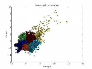
Now we see the result in reverse since we changed the strategy from mean-reverting to trending as described above. It is also easy to see which one of the clusters we would like to extract – the yellow cluster on the upper right. It shows a reasonable train-test correlation and also a positive PnL. We could also do the same process with Sharpe ratio or drawdown but at this point I will leave that to you as an exercise.
In the final part of this section, let’s run an automated code to extract the best cluster like so:
def find_best_cluster(kmeans):
    median_oos_pnl = []
    for label in np.unique(kmeans.labels_):
        median_pnl = np.median(np.array(pnls2)[kmeans.labels_==label])
        median_oos_pnl.append(median_pnl)
    center_mean = np.argmax(np.mean(kmeans.cluster_centers_,axis=1))
    opt_label = np.argmax(median_oos_pnl)
    if center_mean!=opt_label:
        print 'Warning: best center mean is different from median oos pnl'
    return opt_label
This piece of code essentially finds the median OOS PnL for each cluster and extracts the best one. After extraction we just plot the remaining cluster with a linear regression to see what this looks like. Here is the plotting code:
def plot_linreg(x,y):
    m = np.polyfit(x,y,1)
    xx = np.linspace(min(x),max(x),1000)
    yy = np.polyval(m,xx)
    plt.plot(xx,yy)

def plot_best_cluster(kmeans):
    opt_label = find_best_cluster(kmeans)
    x = np.array(pnls1)[kmeans.labels_==opt_label]
    y = np.array(pnls2)[kmeans.labels_==opt_label]
    plt.scatter(x,y)
    plot_linreg(x,y)
    plt.xlabel('train pnl')
    plt.ylabel('test pnl')
Note that this also includes some code for plotting the linear regression. We can see the result in the figure below:
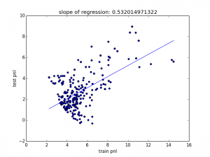
We can see that our slope is approximately 0.5, which can also be seen as the train-test shortfall but remember that our train period was three times as long as our test period. Adjusting for that effectively means that we have better results in the test than in the train period. This might at first seem surprising but since we do not select an individual parameter set but a cluster of strategies this is far from unlikely.
In the next section we look at the parameters that are associated with this cluster. If they are scattered, there is not much we can do with this further on but if they fall into a distinct region, we will remain in business. Let’s wait and see…
The code base for this section can be found on Github.