Quant Basics 7: Identify Best Parameters
In the previous post we used unsupervised machine learning to identify the best cluster of train-test results. The question is: is that cluster meaningful? If the parameters of the moving averages for the cluster are scattered evenly over the parameter space, this cluster may not be very meaningful. On the other hand, if the parameters of this cluster are themselves within a cluster rather than distributed evenly, we have yet more evidence that our parameter sweep has produced something useful.
The code below shows us how to plot a figure that provides us with a visual representation of this. The function find_best_cluster() was shown in the previous section and extracts the cluster that we are interested in. We then use the array contained in kmeans.labels_, which contains the cluster labels to identify the right cluster. Finally, we plot all parameter pairs as well as the ones with our cluster of interest.
def plot_best_parameters(kmeans):
    opt_label = find_best_cluster(kmeans)
    params = cPickle.load(open('params.pick'))
    plt.plot(np.array(params)[:,0],np.array(params)[:,1],'bo')
    plt.plot(np.array(params)[kmeans.labels_==opt_label,0],np.array(params)[kmeans.labels_==opt_label,1],'ro')
    plt.xlabel('parameter 1')
    plt.ylabel('parameter 2')
The figure below shows that our best parameters in red are indeed clustered in a specific region.

If we zoom in we can see that our best cluster occupies the majority of the parameter pairs in this region.

We can now be much more confident that the cluster we have identified is strong, i.e. we have not fallen prey to data mining bias since we have a strong correlation between train and test set and our parameters occupy a defined cluster in the parameter space.
Let’s now find the best parameters within this cluster with the following code:
def get_best_parameters(params,pnls,N):
    idx = np.argsort(pnls)
    unique_params = np.unique(np.array(params)[idx][-N:],axis=0)
    return unique_params
This function uses argsort() to extract the indices of the best parameter sets. Since we use a Monte-Carlo sweep, we will probably end up with some duplication. This will be eliminated with the unique() function. As a result we end up with less parameter sets than we specified initially with N. In this particular case we initially specified 15 sets and ended up with 11 unique ones. We could also specify more set initially in order to receive and exact number of unique ones later, if we like.
Running the code we will get something similar to this:
[[ 5  6]
 [ 5  7]
 [ 5  9]
 [ 5 12]
 [ 5 14]
 [ 5 15]
 [ 5 16]
 [ 5 17]
 [ 5 18]
 [ 6  7]
 [ 6 16]]
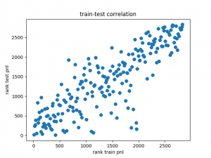
When we limit our parameter sweep to values slightly smaller and larger than the parameters shown above and plot the ranks, we can see that the data are highly correlated.
plt.plot(scipy.stats.rankdata(pnls1),scipy.stats.rankdata(pnls2))
plt.xlabel('rank train pnl')
plt.ylabel('rank test pnl')
The graph below shows the rank correlation between train and test set.

This behaviour is highly encouraging as it confirms the relationship between the train and test data.
Now, let’s plot the PnLs of these parameter sets:
def plot_best_params(params,tickers,start,end,BACKEND):
    p = prices(tickers,start,end,backend=BACKEND)
    for par in params:
        print par
        pnl = (calc_pnl(calc_signals(tickers,p,min(par),max(par)),p))
        plt.plot(p.index,(calc_pnl(calc_signals(tickers,p,min(par),max(par)),p)))
This is how we run it (remember that we’ve defined tickers, start, end and BACKEND in the earlier sections):
best_params = get_best_parameters(params,pnls1,15)
print best_params
plot_best_params(best_params,tickers,start,end,BACKEND)
plt.show()

The performance of these strategies does not look too bad. Remember, we got them from a cluster, which was automatically selected with unsupervised machine learning because the cluster showed a decent correlation between in-sample and out-of-sample performance.
In the next section we run bootstrapping to explore another method for the estimation of OOS performance, then we look for relationships between PnL, Sharpe and drawdown and plot a 3D response surface for our parameter space. All of these tools will give us a better grip on the strategy performance we can expect in the future.
The code base for this section can be found on Github.


